
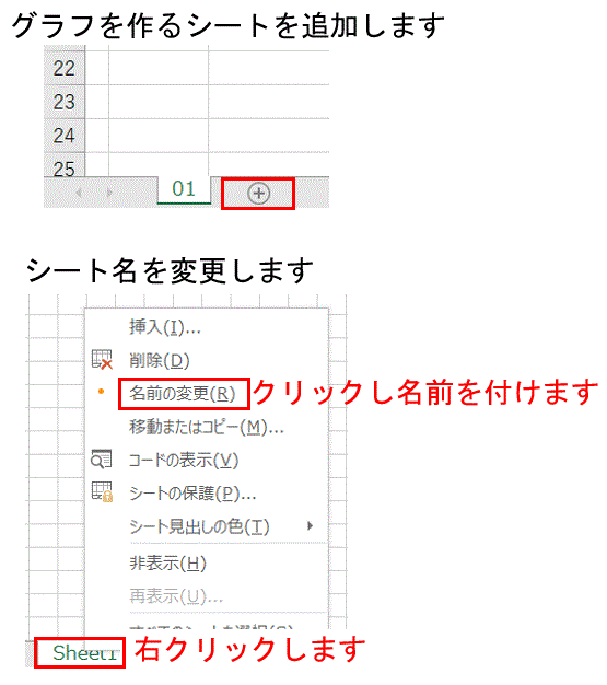
最初にグラフを作成するためのシートを追加し、分かり易くするために名前を変更します。
※名前は変更しなくても大丈夫です。
※データと同一シートにグラフを作成することもできます。
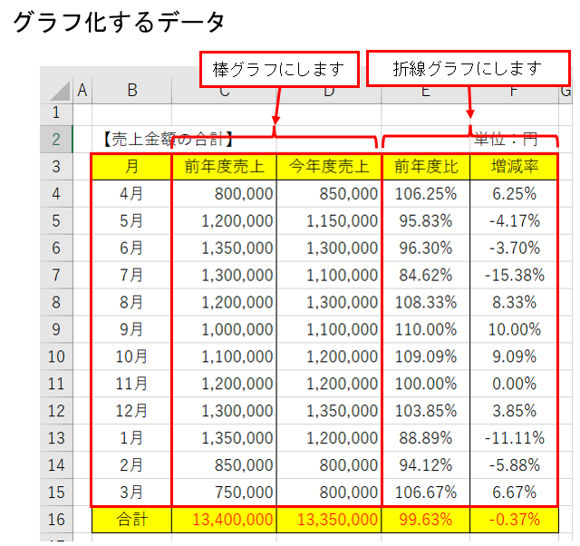
次にどのデータをどのようなグラフにするかを決めます。ここでは下記のようなグラフを作成することにします。
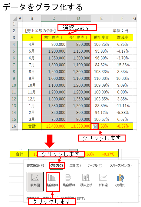
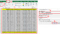
最初に「棒グラフ」にしたいデータを選択します。右下に「クイック分析」のマークが表示されますので「クリック」します。
「グラフ」をクリックし「集合縦棒」を選択します。
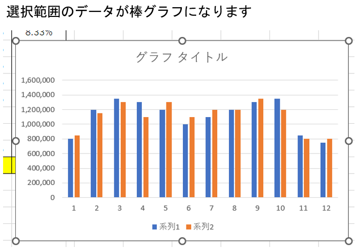
棒グラフが作成されます。
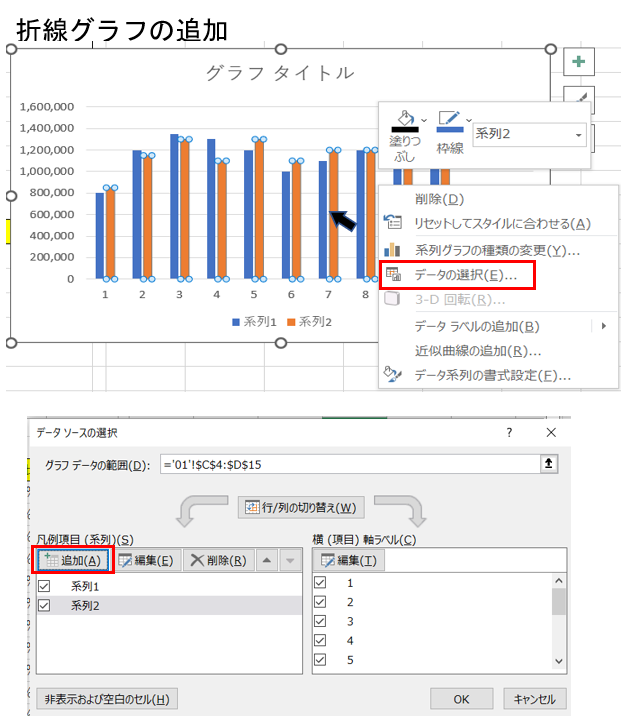
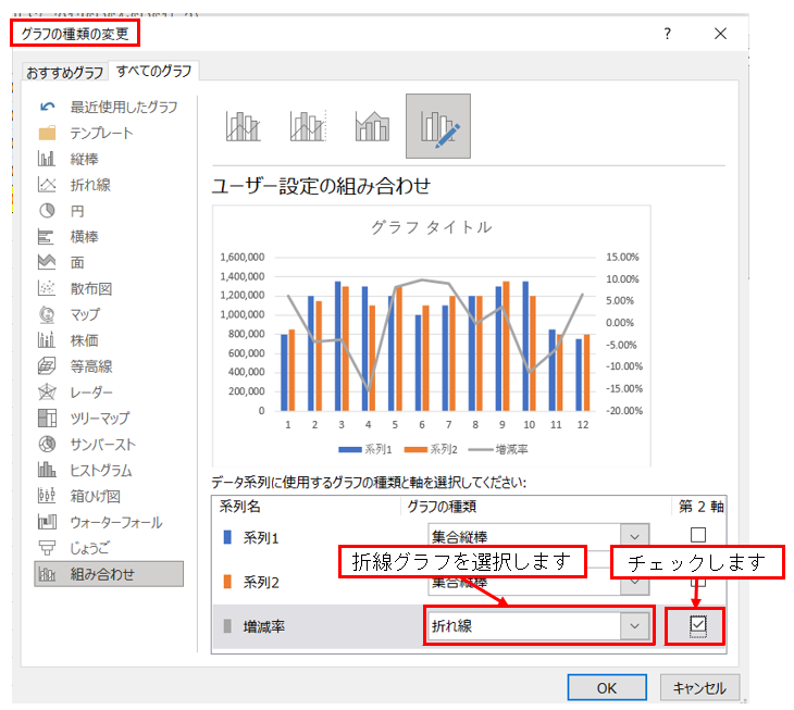
次に「折線グラフ」を追加します。
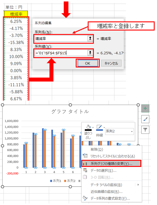
前年度比のデータも同様の方法で追加できます。
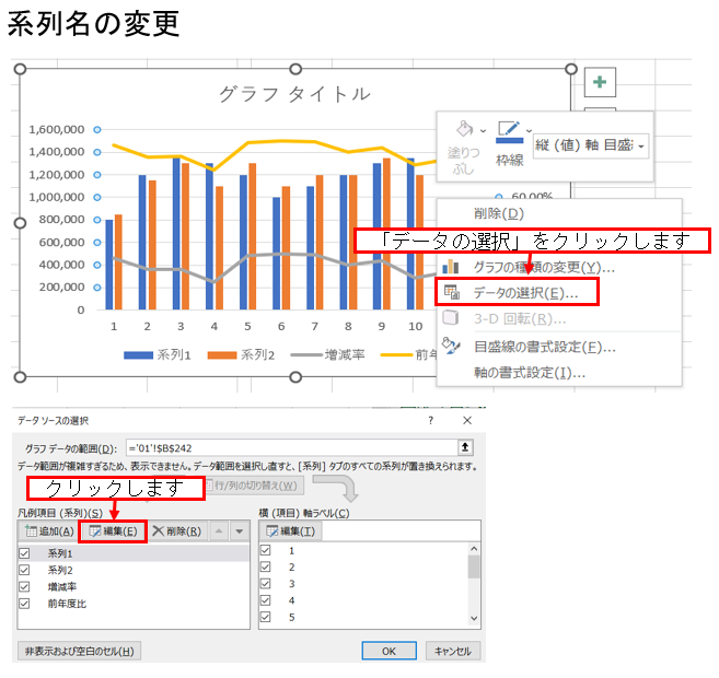
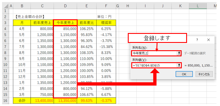
系列名の変更をします。
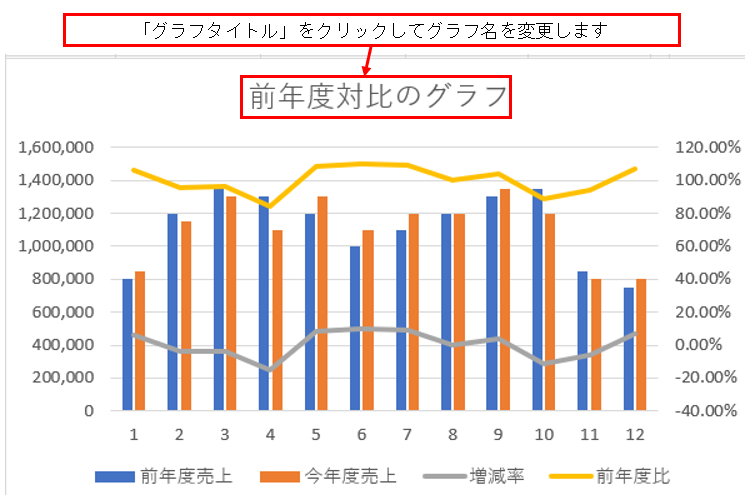
グラフの完成
最後に「グラフタイトル」の変更をします
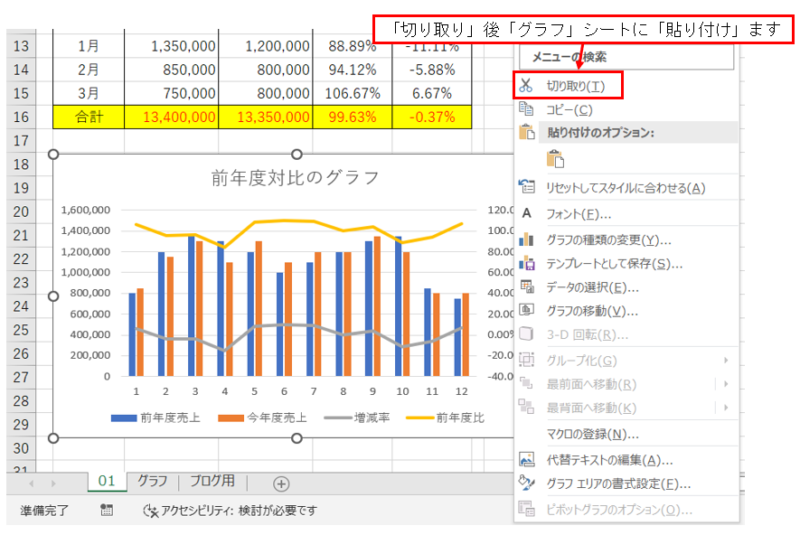
グラフを「グラフシート」に移動します。
コメント